

CASE STUDY
We created a public benefits app
Project Scope
-
User Test Research Plan
-
Guerilla A/B Testing and Interviewing
-
Usability Testing
-
Clickable Prototype
-
Wireframe
-
UI Design Patterns
-
UI Specifications
The Challenge
The Commonwealth of Pennsylvania (PA) enlisted help from Deloitte Digital Studio (Ayannah’s previous team) to create a solution to reduce inefficiencies around their state benefits process. The public assistance and benefits process was very frustrating for both benefits recipients and caseworkers. For benefit recipients, wait times are long, paperwork can be confusing, and mistakes can increase waiting time for receiving government assistance.
The Solution
We developed a CoPA mobile application is a native iOS app meant to help Pennsylvania citizens upload necessary verification documents during the benefits process. Citizens can see details on their benefits and submitted applications. Allowing citizens to see their benefits details help them to understand what benefits they are receiving, any additional requirements for receiving benefits, and denial of benefits information.

The Process and Methodology
Our team followed an agile development lifecycle with user experience design leading the development and iterating the design over three sprints. Though the app would be available on iOS and Android devices, our design patterns followed closely with Google’s Material Design methodology.
Metrics for User Testing
We wanted to make sure the citizens would get the most value out of this app. We set goals to determine design success with clients including:
-
The percentage of people who login into the mobile app
-
The percentage of people for using the mobile app to upload documentation
-
The percentage of people submitting renewals or applications that are error-free and ready for caseworkers to process
To ensure we're on track to reach these targets, we conducted three rounds of qualitative usability tests across three County assistance offices with over 50 benefits recipients and candidates. We used two teams to conduct random user testing in these offices to ensure a diverse perspective. The testing results often came back producing similar results. Some of our findings include:
-
The majority of benefits recipients own an Android device; however, data service may pose an issue for low-income individuals to access the app.
-
The Help options need to be outside on the login screen for those that require help but do not currently own an account.
-
Uploading documents is a beneficial feature to reduce the need to come to the County office; however, most people do not have an account and do not know how to get an account with the state of PA.
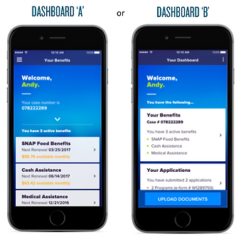
A/B Testing
Our first usability test included A/B Testing to determine the preferred dashboard layout to display a summary of benefits information. Dashboard B won!
Clickable Mobile Prototype
We created a clickable mobile prototype for user testing and to help the development team understand app user flow and transitions. The UX and Visual team worked together to ensure consistency with design patterns and alignment with user testing findings. Between the clickable prototype and the UI specifications, the developers found these to be extremely helpful with developing the app.

Wireframe Specification Document
To ensure design, development, and stakeholders agree to the right features and design to develop, we created and delivered UI and wireframe specifications every sprint to publish change logs, update user stories, and remove user stories as needed. These specification documents were used to verify each screen state and transition. The green check indicated approval of the screens listed on the page.
